Essays on Academia and Higher Education - Chapter 1: Problems We don't Talk About
This is the first of a series of three essays on education. This part focuses on the problems educational system and academic culture.
The second part will examine the hidden assumptions and expectations of academic culture, which will be argued to be the reasons behind the problems that are discussed in this part.
The third part will examine possible solutions to these problems. Rather than simply suggesting that quality of communication and science education in academia should improve, it will take (higher) education, science and academia as separate entities explore the possibility whether they can exist and improve without being needing on each other 11. i.e., Can education and science improve without first having to convince the generally conservative, publication- and teacher-centric, academia (and not student-centric, as in not aiming for the perfect student experience) to adopt more up-to-date communication and teaching techniques?.
These upcoming parts will become available at a later date (for a speculation on when they could be available, see: [Ferrari, 2000]).
Before you begin: A note for an optimal reading experience
During the writing process, this document itself has become a prototype a publishing and reading platform for academic papers 22. Or rather: Anton Eliens (my course instructor at the time of development of this system) asked me to publish it on the web as a website rather than just producing a PDF, and my endeavour to ensure the best experience for the reader exploded into a project on its own. Thus, this web site was designed with one goal in mind: to provide the most ergonomic reading experience for someone who reads an academic paper.
Because the system did not yet go through user testing, some features may not be obvious and you may read without being aware of them. Therefore, these key features are listed below, and I recommend taking a look at them for a pleasurable reading experience and have a taste of the future of reading(!):
• In this text, references are displayed in tooltips, so you can inspect them without having to scroll to the end of the document. For instance, hover over this link to view its reference entry: Amabile, Hadley, & Kramer (2002)
• Footnotes are displayed next to the text where they are referenced, with the aim of providing you a more focused reading experience (i.e., by reducing going back and forth in the document).33. For instance, this is a foot- or rather, a sidenote
• Source Viewer: You can view the sources (e.g., PDF documents, web pages) of references without having to leave what you are reading. For instance please click on this link to view it in a box without leaving the document (you can close the source viewing box by clicking outside of it): Ioannidis (2005). Please note how your cursor looked when you viewed the source; it will look like that whenever this action is available. When you see this cursor, you know that you can explore sources without the fear of losing the spot you were reading, or having to clutter your browser with an additional tab. Of course, if you'd like to view the source document in a new tab or window, you can always do that by right-clicking on a link, or by choosing to do so in the tooltip (for instance, see the link in the tooltip here: Shaw [2014])
• Lightboxed images: You can click on images and view them in a light box. For instance, please click on this picture to view it:
• Tufte styling:The formatting and style of the document is in line with the design guidelines of Edward Tufte for ergonomic reading. Therefore, the choice of font and font size, placement of items on the page, and other visual features are aimed for an ergonomic reading experience.
• Table of contents sidebar (TOC bar): You can click on the items on this sidebar in order to jump to relevant sections or simply look at it to orientate yourself during your reading (i.e., where you are, what you have read so far, and what remains to be read). The position of the position indicator automatically updates itself as you read, but unfortunately, the indicator disappears if you have scrolled too far in the document. To see the indicator again, the reader needs to mouse over the TOC bar and use his/her scroll wheel in order to view the current position on on the TOC bar again. This issue is on the bugs list.
The aim of the project is to make reading academic papers a pleasurable experience, and this requires blurring the line between document and apps. Therefore, sky is the limit—and your comments and suggestions are most welcome!
Happy reading!
John
Plugins and packages used
Education today: Academia is not an optimal place to produce educational materials and deliver education
Academic researchers are not professional educators
(...because the average researcher does not possess sufficient educational design skills to produce high quality instructional materials, and sufficient pedagogy knowledge to deliver high-quality presentations.)
"The success of your presentation will be judged not by the knowledge you send but by what the listener receives." —Lilly Walters
"The mediocre teacher tells. The good teacher explains. The superior teacher demonstrates. The great teacher inspires." —William Arthur
Today's average university lecture is given by researchers who are neither passionate about sharing their knowledge nor talented in teaching (Reiners et al., 2012). Usually, researchers are obliged to teach next to their research activities—which are already enough to cause burnouts due to notoriously high workload of the under-financed and understaffed academia (Jolij, 2016)—, and they mostly do not only lack sufficient pedagogy knowledge to create effective lectures, but also the technical and design knowledge that is required to produce high-quality educational materials—a task that is in the domain of an educational design rather than mere lecturing. Similarly, most of the corpora of text in academic world is not produced by professional writers, but by researchers who are not necessarily passionate about clear communication nor talented in writing (for a discussion, see: Gopen & Swan [1990]).44. Some may argue that it is not necessarily important for academic education and communication to be conducted by professionals (i.e., professional teachers, designers, and writers) because in its current form, it allows students to interact with the real-world of academia rather than a perfect educational environment which everything is unrealistically clear. The real-world academia includes many researchers who are not so good at communicating their ideas; and therefore, it should be students' responsibility to learn the skill of scientific listening (i.e., the skill of overcoming poor communication and understanding nevertheless). Not making education and science communication as clear as it can be, with the intention to to make the process of dissemination of information more realistic, can be considered analogous to creating an unpredictable and unsafe home atmosphere to help children to orientate to the real world in future better, to provide uncooked meals in a restaurant to customers to make their digestive system tougher, or providing an unhygienic hospital environment so that patients can stay orientated to the unclean world outside. Although this contradictory way of thinking becomes apparent when applied to different contexts, it is much harder to notice in an educational culture that merits challenge and hard work even in the way it communicates. Such challenges may inflate individual egos when overcome or used to implicitly test someone else's intelligence, but they do not help with spreading scientific information.
As a result, majority of educational and academic material tends to be created by unqualified individuals, and probably with efficiency and pragmatism in mind. Perhaps it is natural for a lecturer who is under time pressure to opt in for creating PowerPoint slides that are nothing but a series of bullet points—which would, very efficiently, serve three purposes: being memory cues during presentation, serve as lecture notes for students who are not taking their own notes, and be a pool of items from which the exam questions would be picked from (so that it enough students would surely pass the class). Although efficient, it is questionable how much a series of bullet points made of long sentences appearing on a wall for 90 minutes help an audience to remain attentive to a presentation (Reiners et al., 2012; Vogel, Dickson, & Lehman, 1986).
What is strange about such a text-based presentation style is the fact that it remains unchanged despite the fact that we have known for a long time that:
• Humans are bad at processing more than one stream of verbal information (Rollins & Thibadeau, 1973).55. For instance, reading the text from a presentation, listening to the teacher, and taking notes at the same time are all activities that would intrefere with each other, while looking at a picture and listening to someone would not. In fact, the latter is argued to improve learning (Medina, 2015).
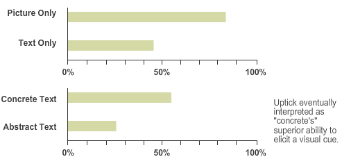
Figure: Pictures are learned more easily than words, and concrete words are learned better than abstract words. (Image source: BrainRules.net: Book Summary (Medina, 2010)
• Brain is primarily a visual system (Medina, 2010) and therefore people learn much better when information is presented through visual materials (Endestad, Magnussen, & Helstrup, 2003; McBride & Dosher, 2002; Stenberg, 2006), and 60-80 percent of people prefer to learn visually (Felder & Soloman, 2006).
• New generation of learners require more visual and interactive learning materials to learn most effectively (Reeves, 2008; Tauber & Johnson, 2014).
But why does academia does not update itself according to what we found out about human cognition and how people learn better, and thus, teach and communicate science scienftifically? Why, in an age of technology, interactivity, and connectivity, most lectures are still presented in the same format they have been for centuries: text on a wall?
Academic researchers do not have enough time and motivation to produce high-quality educational materials
(...because an underbudgeted institution with overworked employees may not be the best place to produce and deliver high quality experiences for their clients [i.e., students]).
"It is simply not possible at any one time to research effectively, teach well, deal with endless administrative demands, put in major grant bids, be permanently available to students, mark (often lots of) work and have some kind of sensible, balanced work-life ratio." — Miles, as quoted in Shaw (2014)
Time and budget constraints are the first answers to come into mind and they are likely to be an important reason. Indeed, workflow of an academic researcher resembles a startup entrepreneur—both are knowledge workers66. "Knowledge workers are workers whose main capital is knowledge. Examples include software engineers, physicians, pharmacists, architects, engineers, scientists, public accountants, lawyers, and academics, whose job is to 'think for a living.'" (Davenport, 2015) who are one-man orchestras with their multitude of skills and myriad of tasks. An average researcher today must be an experimenter, data analyst, writer, programmer, marketer (e.g., in conferences), a teacher, and his/her own secretary all at the same time—and accomplish pulling this off without any project- or time management training. In the same way, senior researchers are bogged down by administrative and managerial tasks rather than focusing on their core research competencies (Shaw, 2014; Wilcox, 2014). As a result, something has to give, and the time and effort spent on preparing lecture materials and teaching in general are likely to be one of the first to sacrifice—as the cost of giving a mediocre lecture is relatively low compared to making a mistake in programming or in data analysis because of rushing things, or compared to missing a deadline.
The cost of giving a bad lecture is likely to be even lower in the academic environment where intelligence is the currency and therefore admitting that a listener did not understand a presentation may put him or her in a vulnerable position (e.g., this person may be perceived as slow). As an extension of this attitude, students also seem to blame themselves for not understanding a text book or article, rather than questioning the quality of the instruction or the design of teaching materials.
Because students are as overworked as academics themselves—thanks to belief of researchers that learning can only occur through going through a spartan workload—it is also arguable how much energy and motivation are left in students to provide extensive feedback on course evaluation forms provided by a faculty after the end of the course (let alone if they fill the forms at all). And even if they do provide their feedback, as just discussed, they likely to blame themselves for their poor performance more than they blame the teacher or educational materials (unless there are extreme problems with the teacher).
Therefore, it is quite possible that academics do not receive accurate feedback on their teaching performance and teaching materials, and continue to presume that what they deliver is high quality—something that they are usually quite happy to presume due to their hectic work lives that leave no time for time-consuming revisions and updates to their courses. In the end, students continue their education and gain knowledge mostly by self-study and even despite their instructors and their teaching materials, while instructors keep assuming learning happens because of them.
Academic culture tolerates low-quality educational materials and poor scientific communication skills
(...because when academic audiences do not understand a lecture or paper, they blame themselves and not the educational materials or the instruction they received [When is the last time you walked out of a lecture because it was bad or refused to read a text book or article because it was badly written?].)
“The success of your presentation will be judged not by the knowledge you send but by what the listener receives.” —Walters
Some students and academics may have a more critical attitude than others, but the level of criticism academic teaching and communication materials receive are likely to be incomparable to the level of criticism other similar mediums of information consumption and presentation would receive; for instance, a documentary, a stage performance, a speech on television, or a movie...
Although we can be harsh critics and spoiled consumers in other contexts, and blame the performers or materials instead of questioning our intelligence, we become strangely non-critical and self-blaming when we don't understand a lecture or an academic paper. When a lecturer talks gibberish for an hour or a paper consists of paragraphs of text that needs to be read at least five times to be understood, and we don't understand this lecture or paper, we think that is is because we have attention problems, not have enough interest or background on the topic, and so on; but we rarely seek the fault in the communication and presentation (i.e., pedagogical) skills of the lecturer
This is likely to be related to conditioning we received since our childhood, which puts the knower (i.e., the teacher) on a superior place and the learner (i.e., the student) on an inferior one in an unwritten but strongly imposed hierarchy. This approach may keep the schools orderly, and lecturers and researchers respected (even when they don't spend much time on perfecting their craft), but it is an attitude that is detrimental for educational design, which, as proven many times in other areas of design and communication (e.g., Stone, Jarrett, Woodroffe, & Minocha, 2005), needs to be user-centric, and not institution or communicator-centric process.
Scientific information is inaccessible
(...because being hard to understand is not an intrinsic property of scientific information; it is a failure of researchers to communicate clearly.)
"Confusion and clutter are failures of design, not attributes of information." — Tufte, 1990
Science is hard to read
"The fundamental purpose of scientific discourse is not the mere presentation of information and thought, but rather its actual communication. It does not matter how pleased an author might be to have converted all the right data into sentences and paragraphs; it matters only whether a large majority of the reading audience accurately perceives what the author had in mind." —Gopen and Swan (1990)
“If the reader is to grasp what the writer means, the writer must understand what the reader needs.” —Gopen and Swan (1990)
In today's society, not being able to understand a scientific article is considered normal by the average person, and this inaccessibility of knowledge is seen as an intrinsic part of scientific communication. This is not only the attitude of laypersons, but also of researchers who may come across publications or lectures from a discipline that they are not specialized in (e.g., a psychologist reading a physics paper), or even of those who may peek at a similar field of research (e.g., a social psychology researcher reading a cognitive neuroscience paper). The cryptic language of science does not only create a barrier between science and society, but also between disciplines of science. But is it really the case that being hard to understand is an intrinsic property of scientific communication? Can't there be science papers that are understandable by everybody? 77. Although it can be argued that popular science magazines serve the purpose of communicating scientific findings to a public audience (and be that as it may), such magazines act as an additional interface between the original source of information and the reader, and therefore, communicate already interpreted information. Even though this may be desirable in some cases, it does not warrant saying that research papers must not be written in an accessible language because popular science magazines already accomplish this. Inaccessible language obstructs not only the understanding of public and leaves no other option but to consume unscientific but accessible information, but also averts scientists of other fields and thus hampers interdisciplinary research—something that is much desired in research. Furthermore, it makes learning harder for students and makes it hard to communicate even within a researcher's own field of inquiry.
Probably the most common argument against using an accessible language in science is that doing so would be oversimplifying things, and such simple language would reduce the bandwidth of communication and quality of thought. However, this concern is based on the assumption that what makes science hard to understand is the jargon, and is therefore a false assumption (Gopen and Swan, 1990). Jargon is not the main source unclarity in scientific papers, and in fact, a paragraph without any technical terms can still be hard to read (for an example, see first table below).
The problem lies not merely in jargon but in syntactic properties of the sentences and in non-ergonomic writing style. When written properly, paragraphs that are full of terms become as understandable as any nicely written piece of text. For an example, see the second table table below, in which an original scientific passage was revised for readability.
| Original passage | Version with terms and difficult words removed |
|---|---|
| The smallest of the URF's (URFA6L), a 207-nucleotide (nt) reading frame overlapping out of phase the NH2-terminal portion of the adenosinetriphosphatase (ATPase) subunit 6 gene has been identified as the animal equivalent of the recently discovered yeast H+-ATPase subunit 8 gene. The functional significance of the other URF's has been, on the contrary, elusive. Recently, however, immunoprecipitation experiments with antibodies to purified, rotenone-sensitive NADH-ubiquinone oxido-reductase [hereafter referred to as respiratory chain NADH dehydrogenase or complex I] from bovine heart, as well as enzyme fractionation studies, have indicated that six human URF's (that is, URF1, URF2, URF3, URF4, URF4L, and URF5, hereafter referred to as ND1, ND2, ND3, ND4, ND4L, and ND5) encode subunits of complex I. This is a large complex that also contains many subunits synthesized in the cytoplasm. | The smallest of the URF's, and [A], has been identified as a [B] subunit 8 gene. The functional significance of the other URF's has been, on the contrary, elusive. Recently, however, [C] experiments, as well as [D] studies, have indicated that six human URF's [1-6] encode subunits of Complex I. This is a large complex that also contains many subunits synthesized in the cytoplasm. |
Table: Although most people would probably point out to the jargon as the culprit that makes scientific papers inaccessible, and many of them would accept this as a natural result of the technicality of the domain that they are reading about, removing all terms and difficult words from a passage does not necessarily make it easy to read. (Table taken from Gopen and Swan [1990])
| Original passage | Version revised for better readability |
|---|---|
| The smallest of the URF's (URFA6L), a 207-nucleotide (nt) reading frame overlapping out of phase the NH2-terminal portion of the adenosinetriphosphatase (ATPase) subunit 6 gene has been identified as the animal equivalent of the recently discovered yeast H+-ATPase subunit 8 gene. The functional significance of the other URF's has been, on the contrary, elusive. Recently, however, immunoprecipitation experiments with antibodies to purified, rotenone-sensitive NADH-ubiquinone oxido-reductase [hereafter referred to as respiratory chain NADH dehydrogenase or complex I] from bovine heart, as well as enzyme fractionation studies, have indicated that six human URF's (that is, URF1, URF2, URF3, URF4, URF4L, and URF5, hereafter referred to as ND1, ND2, ND3, ND4, ND4L, and ND5) encode subunits of complex I. This is a large complex that also contains many subunits synthesized in the cytoplasm. | The smallest of the URF's, URFA6L, has been identified as the animal equivalent of the recently discovered yeast H+-ATPase subunit 8 gene; but the functional significance of other URF's has been more elusive. Recently, however, several human URF's have been shown to encode subunits of rotenone-sensitive NADH-ubiquinone oxido-reductase. This is a large complex that also contains many subunits synthesized in the cytoplasm; it will be referred to hereafter as respiratory chain NADH dehydrogenase or complex I. Six subunits of Complex I were shown by enzyme fractionation studies and immunoprecipitation experiments to be encoded by six human URF's (URF1, URF2, URF3, URF4, URF4L, and URF5); these URF's will be referred to subsequently as ND1, ND2, ND3, ND4, ND4L and ND5. |
Table: Writing an accessible text does not require omission of scientific terms. A passage that has been in scientific terms can still be easily readable. (Table taken from Gopen and Swan [1990])
Therefore, writing easy-to-read passages is a more sophisticated process then simply removing jargon; it requires a good knowledge of writing, and equally good skills in perspective taking in order to understand the reader—hence the existence of good and bad writers, the rarity of the good ones, and the urgent need to realize in academia that the ability to come up with challenging sentences does not make one a good writer88. And even though the ability to talk with complex sentences could be considered a sign of a healthy brain and good linguistic skills, we have to decide whether the goal of academic communication is mental exercise and a place where we ponder over the literary merits of sentences that challenged us, or, it is rather communication of facts in an effective and efficient manner. 99. . For a good source of writing advice for researchers, see Gopen and Swan (1990) and the highly acclaimed book of Williams & Colomb (1995).
Academia does not like using visualizations
"Imagine a society in which the citizens are encouraged, indeed compelled up to a certain age, to read (and sometimes write) musical scores. All quite admirable. However, this society also has a very curious (few remember how it all started) and disturbing law: Music must never be listened to or performed! Though its importance is universally acknowledged, for some reason music is not widely appreciated in this society. To be sure, professors still excitedly pore over the great works of Bach, Wagner, and the rest, and they do their utmost to communicate to their students the beautiful meaning of what they find there, but they still become tongue-tied when brashly asked the question, 'What's the point of all this?!' In this parable, it was patently unfair and irrational to have a law forbidding would-be music students from experiencing and understanding the subject directly through 'sonic intuition.' But in our society of mathematicians we have such a law. It is not a written law, and those who flout it may yet prosper, but it says, Mathematics must not be visualized! More likely than not, when a mathematics student today opens a random text on a random subject, he is confronted by abstract symbolic reasoning that is divorced from his sensory experience of the world, despite the fact that the very phenomena he is studying were often discovered by appealing to geometric (and perhaps physical) intuition." —Needham (1997)
Although it is shown that visualizations can communicate information at least as effectively as text and words (McBride & Dosher, 2002; Endestad et al., 2003; Stenberg, 2006; Reiners et al., 2012) and even though they are known to be an effective instruction and communication modality than using text alone, visuals are seldom used in academic education and scientific publications (Murphy, Gray, Straja, & Bogert, 2004; Needham, 1997). 1010. And in cases where they are used, visualizations are usually employed only as a necessity when there is no other way to communicate something. Furthermore, they require reading a substantial amount of explanation before they can be interpreted, and thus, usually accomplish no further than being a modest accessory to text whose function is limited by formality and poor, inaccessible design.
Besides their accessibility, effectiveness (i.e., being easier to understand and remember than pure text and speech), and motivational effects1111. As an exercise in experiencing the motivational effects of visualization, you may want to compare these two books that are written on on the same topic, and try to feel how much aversion and attraction each one creates in you:
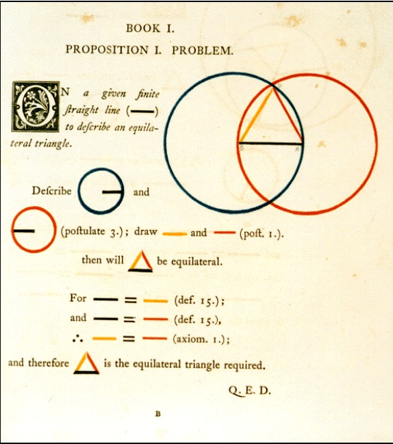
Image above:A treatment of Euclides' geometry in a widely used text book.
Image above: A visual treatment of the same topic (Byrne, 1847)., visual materials are also more efficient to process. If they were used more often, they could have not only reduced the time required to gain insight into a subject by students, but also made scientific communication more efficient and save significant amounts of time when a researcher attempted to locate information. Compared to text-only articles —which usually fails to state their findings and conclusions in their abstracts— it would require only a fraction of the time to gain an overview of the article, and also, to find the information in future 1212. E.g., imagine the time it would take to find a sentence in a book that you read, compared locating a picture Such an efficient research experience is sorely needed by students and researchers alike, especially in today's knowledge work environments where time and resources are becoming ever more scarce. But if their benefits are so obvious, why are they not being used everywhere?
Probably the first reason is the fact that even though visualizations are efficient to consume, they are time consuming to produce. This presents itself as a problem for today's overworked academic researcher who must prioritize methods that are efficient over the ones that are better. 1313. Perhaps simply putting words on a PowerPoint slide is much more efficient for a researcher but it certainly isn't for his audience, as this exposes them to two streams of verbal information that cannot be processed without continuously switching back and forth between them (Rollins & Thibadeau, 1973) (i.e., listening and reading; and even writing as a third stream if the listener is taking notes). This way of listening, compared to attending to visuals on the white screen while listening to teacher is likely to be much more energy consuming and inefficient for audience.
A second commonly found argument is that the visual language does not offer the precision of text and therefore is not a suitable medium of communication. However, this does not warrant completely ignoring the benefits of visual language in communication and instruction. It is not hard to imagine a scenario where both textual and visual forms of information are used together in a way that supports each other. Such a style, for instance, would allow readers to quickly gauge whether the information is relevant to their goals, as visuals would be able to provide an overview in a several seconds, and if readers are interested, they may delve deeper in either in a relevant part or the whole of the text (an example of such a blend can be seen in visualization of Magnusson (2014).
In conclusion, although the lack of time and the suspicions of accuracy explains the absence of visual materials in academia to an extent, they are not convincing enough to make a case for why we don't teach and communicate science scientifically: we ignore the myriad of scientific findings on the benefits of visual communication and stick to an almost purely verbal and text-based methods.
Perhaps the underlying reason has to do more with a lack of motivation than a lack of time...
Reasons behind the ivory tower: The unspoken assumptions of the academic culture
"Much […] depends on the first communication of any science to a learner, though the best and most easy methods are seldom adopted. Propositions are placed before a student, who though having a sufficient understanding, is told just as much about them on entering at the very threshold of the science, as gives him a prepossession most unfavorable to his future study of this delightful subject; or 'the formalities and paraphernalia of rigour are so ostentatiously put forward, as almost to hide the reality. Endless and perplexing repetitions, which do not confer greater exactitude on the reasoning, render the demonstrations involved and obscure, and conceal from the view of the student the consecution of evidence.' Thus an aversion is created in the mind of the pupil, and a subject so calculated to improve the reasoning powers, and give the habit of close thinking, is degraded by a dry and rigid course of instruction into an uninteresting exercise of the memory. To raise the curiosity, and awaken the list lists and dormant powers of younger minds should be the aim of every teacher; but where examples of accidents are one thing, the attempts to attain it are but few, while Eminence excites attention and produces imitation." —Byrne, 1847
If the benefits of clear textual communication is clear, then why aren't researchers are trained in written communication skills as rigorously as they are trained in, for instance, data analysis? After all, what good is a scientific finding if it cannot be communicated? And if research shows that visual materials significantly increase effectiveness and efficiency of instruction and communication, then why aren't academics are more motivated to produce better educational materials by using them?
Perhaps this has to do with the fact that being able to read and write the cryptic and ostentatious language of science makes us feel intelligent, and going through some degree of pain before we gain an insight makes it more valuable, and also makes us feel more deserving of it—much like the way we feel happier to acquire an item when we pay a higher price for it (Plassmann, O’Doherty, Shiv, & Rangel, 2008). It is probably also the case that we use the same notions when we are setting expectations and evaluating others. An intelligent student, after all, must be able to understand complex scientific articles and be undaunted by pages of black and white text and numbers, and go through a series of tests and challenges before he can be deemed knowledgeable on a topic or create something of scientific value.
But what do we do when these assumptions and expectations are violated? Could it be the case that we use them the other way round, and rather than using them as a summary of our previous experience, we use them as heuristics when predicting the value of our future experiences? (i.e., "Almost every learning experience I had learned so far was painful, therefore it is unlikely that an educational material that promises to be painless can also effective".) And perhaps we pass on our educational experiences and traumas to our students when we become teachers, just like an abused child could become the abuser when s/he becomes a parent (i.e., "I learned this topic by reading thick books on it for months, day in, day out. Of course this is a hard to learn topic and you will go through these pages like I once did.")
For instance, when we hear that a student learned a medical topic in a 10-minute animated movie (e.g., Vizbi.org, n.d.) much more effectively than in a 2-hour lecture by a renowned professor, we may assume that the student is lying and trying to belittle his professor. Or when we see a book full of colors and devoid of any black and white numbers and letters (e.g., Byrne, 1847) yet claims to teach Euclidean geometry in one third of the time required by books in the curriculum, we call that either daydreaming or see it as nice attempt for a visually oriented and analytically incapable minority, an attempt that looks too colorful and childish to have a place in academia. And when we hear that a student finally understood basic statistics after years and years of education, but not through another course or a dry statistics book but through an interactive visualization (e.g., Magnusson, n.d.), we think that the student is either lazy or has another learning problem, and that such a system cannot be really effective because we are not living in 2050 yet.
These judgements, however, may not be accurate. The reason that such alternative methods may be more effective yet unappreciated in academia might have something to do with the preferences in academic culture rather than their actual effectiveness; and the reason why students feel aversion towards the classical educational materials, yet they are enchanted upon seeing the same information in a different way (for examples, see Lokman [2015]) could have something to do with the ergonomic properties and motivational qualities of these learning materials.
It seems that the negative judgements towards ways of instruction that are too colorful or fun arise from two unspoken assumptions and expectations lie at the core of in academia: (1) scientists are smart, and therefore understanding their communications is a privilege of the intelligent; and (2) learning is and research are painful processes, and doing science is generally hard; therefore understanding scientific information is a privilege of the most disciplined. Although colorful and fun educational materials may be more effective than those that are not, they challenge these assumptions. These and other assumptions will be discussed in detail in the following parts of this series.
A summary of upcoming chapter and relevance to current project
Analyzing all assumptions behind why scientific information is theoretically open to everyone but practically accessible only by a privileged intellectual minority is not in scope of this part of the essay. However, although the next part of the essay series will provide a deeper analysis, some of the points that will be broached can be summarized as following:
Assumption 1 - Scientific information is complex and hard to grasp, and it requires a high IQ to understand. Criticism: Good communicators and teachers, if they had truly grasped the nature of their topics, would be able to make their audiences understand their insights (within a reasonable amount of time). It can further be theorized that for information to be communicated, a total amount of effort must be spent by the communicator (e.g., 240 hours in preparing a course) and the listeners (e.g., 6400 hours of student time in a 40-person class that requires 20 hours takes 2 months to complete), and it is likely that these amounts are inversely correlated (i.e., if teacher spends more time in explaining better, the students will spend less time in trying to understand). This effort seems to be too low on the side of the instructors in academia.
Assumption 2 - Scientific tasks are complex and hard to perform, and they require a lot of discipline to complete. Criticism: Scientific tasks are hard to perform because of the tools we are using and our low expectations when it comes to how accessible they can be. For instance, even though it is an excruciatingly time consuming task (and technology is certainly advanced enough to overcome it) ergonomic reference management and citation software has been in their crib in the past 10 years. The same thing is true for other scientific software such as fMRI analysis packages and so on.
Assumption 3: Science is a serious endeavour; a hardcore scientist does not need fancy presentations or colorful graphics to understand something. Criticism: Although emotions are not part of the methodology of science, they are an inseparable part of human learning and effort. Academia confuses the objectiveness required by the scientific method with the way a scientist or student thinks and feels: Academia fails to contain the coldness of scientific method within the method itself, and let it pervade the academic workplace, academic communication, and academic instruction. This makes science an unattractive and cold endeavour, even though it has the potential to inspire, enlighten, and thus change the lives of billions of people.
Assumption 4: Academia deals with the search for truth and it is different from a business. Criticism: Academia does not equal science, and it is becoming a place that is increasingly less and less suitable to pursue scientific interests due to publication pressure. In it's current form, academia resembles any other business that must produce a product. Academia is becoming a paper factory and this presents a challenge: Academics either has to accept that they are subject to the working principles of businesses and adapt business paradigms accordingly (e.g., division of roles in order to produce higher quality products more efficiently; for instance by letting professional writers write, professional programmers program, and professional teachers teach), or become an institution that authentically seeks truth and not publicity through journals. Failure to choose a path will, at best, will lead to an exacerbation of the current problems in academia and education, and at worst, lead to rise of institutions that do science and deliver education better than academia, and thus leaving academia as nothing but a skill certification institute. Rather than waiting for academia to change its ways, Plato, as an online education platform, has the ambition to be the latter; and its first prototype is a product of this course.
To be continued...
Further Reading and Viewing
This is a list of resources that will be updated periodically. If you have suggestions, please do feel free to let me know!
Examples of ergonomic educational materials
- VizbiPlus — A selection of animations on latest biomedical research:
- Interactive visualizations for understanding statistical concepts: (Rpsychologist.com): Statistical power and significance testing, Confidence intervals, Correlations, Bayesian inference, Cohen's d effect size, Distribution of p-values when comparing two groups, t-distribution, ANOVA
- A visual introduction to machine learning on R2D3.us (Thanks to Alexander)
- Neural networks (Thanks Alexander!)
- Interactive visualizations for understanding Fourier series—a statistical method for analyzing rhythms (e.g., of the brain): Interactive visualization 1, Interactive visualization 2
- Two presentations showcasing possibilities with presentation design (author's work): Communicating concepts, Communicating research findings
Reading materials with similar tone
- Peter Higgs: I wouldn't be productive enough for today's academic system — Thoughts of a Nobel prize winning physicist on the current state of academia
- Working hours — A commentary on life-work balance in academia
- Academics Anonymous: Why I'm leaving academia
Initiatives
- Vizbi.org — — An Australian conference initiative focusing on visualizations in life sciences
- Youcubed.org — An initiative at Stanford University for improving math education
References
Byrne, O. (1847). The first six books of the elements of Euclid, in which coloured diagrams and symbols are used instead of letters for the greater ease of learners. London: William Pickering. Retrieved from https://archive.org/details/firstsixbooksofe00byrn
Davenport, T. H. (2005). Thinking for a Living: how to get better performance and results from knowledge workers. Harvard Business School Press (Vol. 18). http://doi.org/10.1002/hrdq.1221
Endestad, T., Magnussen, S., & Helstrup, T. (2003). Memory for pictures and words following literal and metaphorical decisions. Imagination, Cognition and Personality, 23(2), 209–216. Retrieved from http://dx.doi.org/10.2190/PNXA-4078-M1H9-8BRJ
Felder, R. M., & Soloman, B. a. (2006). Learning styles and strategies. Retrieved July 3, 2016, from http://www4.ncsu.edu/unity/lockers/users/f/felder/public/ILSdir/styles.htm
Ferrari, J. R. (2000). Procrastination and Attention: Factor Analysis of Attention Deficit, Boredomness, Intelligence, Self-Esteem, and Task Delay Frequencies. Journal of Social Behavior & Personality, 15(5), 185–196. Retrieved from http://search.ebscohost.com/login.aspx?direct=true&db=a9h&AN=10637211&site=ehost-live
Gopen, G., & Swan, J. (1990). The science of scientific writing. American Scientist, 78, 550–558. http://doi.org/10.1007/978-0-387-77415-2
Jolij, J. (2016, February 23). Working hours. Retrieved July 18, 2016, from http://www.jolij.com/?p=399
Lokman, J. C. (2015). Ergonomic Statistics. Retrieved July 27, 2016, from https://github.com/clokman/cognitive-ergonomics/blob/master/Ergonomic Statistics.md
Magnusson, K. (2015). Understanding Statistical Power and Significance Testing. Retrieved July 27, 2016, from http://rpsychologist.com/d3/NHST/
Magnusson, K. (2014). Interpreting Cohen’s d effect size an interactive visualization. Retrieved July 27, 2016, from http://rpsychologist.com/d3/cohend/ McBride, D. M., & Dosher, B. A. (2002). A comparison of conscious and automatic memory processes for picture and word stimuli: A process dissociation analysis. Consciousness and Cognition, 11(3), 423–460. http://doi.org/10.1016/S1053-8100(02)00007-7
Medina, J. (2010). Brain Rules: 12 Principles for Surviving and Thriving at Work, Home, and School. Pear Press. Retrieved from https://books.google.nl/books?id=G_GbZ6rDUrsC
Medina, J. (2015). BrainRules.net: Rule #10: Vision Trumps All Other Senses. Retrieved July 18, 2016, from http://www.brainrules.net/vision
Murphy, R. J., Gray, S. a, Straja, S. R., & Bogert, M. C. (2004). Student learning preferences and teaching implications. Journal of Dental Education, 68(8), 859–866. Retrieved from http://www.ncbi.nlm.nih.gov/pubmed/15286109
Needham, T. (1997). Visual Complex Analysis (1st ed.). Oxford University Press. http://doi.org/10.2307/3618747
O’Toole, G. (n.d.). Everything Should Be Made as Simple as Possible, But Not Simpler. Retrieved July 19, 2016, from http://quoteinvestigator.com/2011/05/13/einstein-simple/
Plassmann, H., O’Doherty, J., Shiv, B., & Rangel, A. (2008). Marketing actions can modulate neural representations of experienced pleasantness. Proceedings of the National Academy of Sciences of the United States of America, 105(3), 1050–1054. http://doi.org/10.1073/pnas.0706929105
Reeves, T. C. (2008). Do generational differences matter in instructional design. J Handbook of Research on Educational Communications and Technology. Retrieved from http://it.coe.uga.edu/itforum/Paper104/ReevesITForumJan08.pdf
Reiners, T., Wood, L. C., Chang, V., Gütl, C., Herrington, J., Teräs, H., & Gregory, S. (2012). Operationalising gamification in an educational authentic environment. In IADIS International Conference on Internet Technologies & Society (Vol. 2012, pp. 93–100).
Robert Jacobson. (2000). Information Design. MIT Press.
Rollins, H. A., & Thibadeau, R. (1973). The effects of auditory shadowing on recognition of information received visually. Memory & Cognition, 1(2), 164–168. http://doi.org/10.3758/BF03198088
Shaw, C. (2014, May). Overworked and isolated - work pressure fuels mental illness in academia. The Guardian. Retrieved from https://www.theguardian.com/higher-education-network/blog/2014/may/08/work-pressure-fuels-academic-mental-illness-guardian-study-health
Stenberg, G. (2006). Conceptual and perceptual factors in the picture superiority effect. European Journal of Cognitive Psychology, 18(June), 813–847. http://doi.org/10.1080/09541440500412361
Stone, D., Jarrett, C., Woodroffe, M., & Minocha, S. (2005). User Interface Design and Evaluation. German Research, 21(3), 705. http://doi.org/10.1057/palgrave.ivs.9500112
Tauber, T., & Johnson, D. (2014). Meet the Modern Learner (Infographic). Bersin, Deloitte.com. Retrieved from https://www.bersin.com/Practice/Detail.aspx?id=18071
Vizbi.org. (n.d.). Vizbi: Visualizing biological data. Retrieved July 27, 2016, from https://vizbi.org/Plus/
Vogel, D. R., Dickson, G. W., & Lehman, J. A. (1986). Persuasion and the Role of Visual Presentation Support: The UM/3M Study, (June), 21.
Wilcox, C. (2014, October). Lighting dark: Fixing academia’s mental health problem. New Scientist. Retrieved from https://www.newscientist.com/article/dn26365-lighting-dark-fixing-academias-mental-health-problem/
Williams, J. M., & Colomb, G. G. (1995). Style: Toward Clarity and Grace. University of Chicago Press. Retrieved from https://books.google.nl/books?id=wheCdBUIpwIC